9. Shifts in supply or demand II The following graph shows the market for...
1)
9. Shifts in supply or demand II
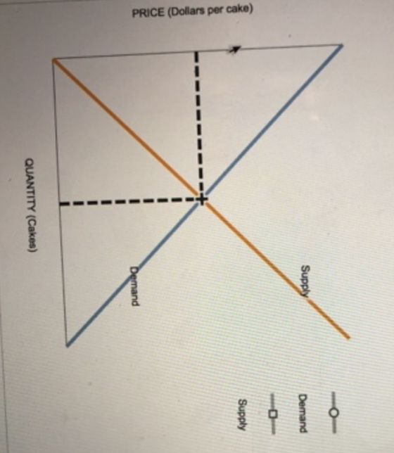
The following graph shows the market for cakes in Miami, where there are over 1,000 bakeries at any given moment. Suppose the price of flour, a major ingredient in cakes, suddenly increases.
Show the effect of this change on the market for cakes by shifting one or both of the curves on the following graph, holding all else constant.
2)
10. Market equilibrium
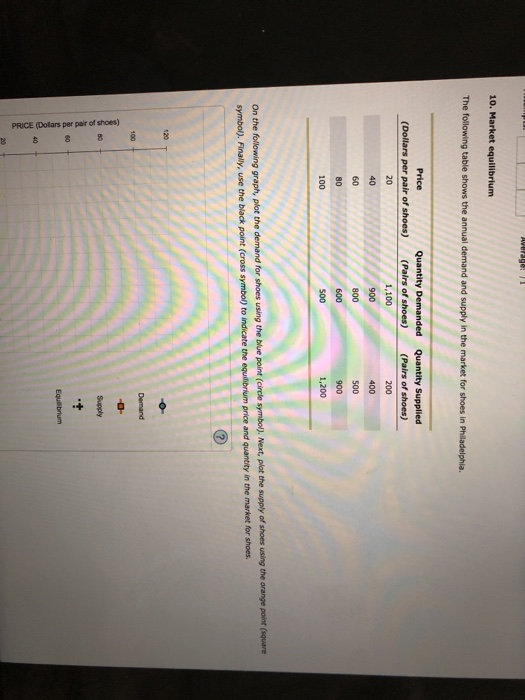
The following table shows the annual demand and supply in the market for shoes in Philadelphia.
| Price (Dollars per pair of shoes) | Quantity Demanded (Pairs of shoes) | Quantity Supplied (Pairs of shoes) |
|---|---|---|
| 20 | 1,100 | 200 |
| 40 | 900 | 400 |
| 60 | 800 | 500 |
| 80 | 600 | 900 |
| 100 | 500 | 1,200 |
On the following graph, plot the demand for shoes using the blue point (circle symbol). Next, plot the supply of shoes using the orange point (square) symbol). Finally, use the black point (cross symbol) to indicate the equilibrium price and quantity in the market for shoes.
Homework Answers

Add Answer to:
9. Shifts in supply or demand II The following graph shows the market for...
7. Movements along versus shifts of supply curves Consider the market supply of...
 1)7. Movements along versus shifts of supply curvesConsider the market supply of peanut butter.Complete the following table by indicating whether an event will cause a movement along the supply curve for peanut butter or a shift of the supply curve for peanut butter, holding all else constant.EventMovement AlongShiftA change in expectations about the future price of peanut butterA decrease in the price of peanut butterA change in technology that makes it less costly to produce peanut butter2)9. Shifts in supply...
The following table shows the weekly demand and supply in the market for shoes in Houston.
 6. Market equilibriumThe following table shows the weekly demand and supply in the market for shoes in Houston.Price (Dollars per pair of shoes)Quantity Demanded (Pairs of shoes)Quantity Supplied (Pairs of shoes)201,1002004090040060800500806009001005001,200On the following graph, plot the demand for shoes using the blue point (circle symbol). Next, plot the supply of shoes using the orange point (square symbol). Finally, use the black point (cross symbol) to indicate the equilibrium price and quantity in the market for shoes.
10. Market equilibrium The following table shows the weekly demand and supply in the market for...
 10. Market equilibrium The following table shows the weekly demand and supply in the market for shorts in Philadelphia Quantity Demanded Quantity Supplied (Dollars per pair of shorts) (Pairs of shorts) (Pairs of shorts) 1,650 1,350 1,200 900 750 300 12 500 18 1,350 30 1,800 On the following graph, plot the demand for shorts using the blue point (circle symbol). Next, plot the supply of shorts using the orange point (square symbol). Finally, use the black point (cross symbol)...
9. Shifts in supply or demand II The following graph shows the market for hot dogs...
 9. Shifts in supply or demand II The following graph shows the market for hot dogs in Philadelphia, where there are over 1,000 hot dog stands at any given moment. Suppose the number of hot dog stands increases significantly. Show the effect of this change on the market for hot dogs by shifting one or both of the curves on the following graph, holding all else constant.
3. Market equilibrium The following table shows the annual demand and supply in the market for...
 3. Market equilibrium The following table shows the annual demand and supply in the market for shorts in Detroit. Price Quantity Demanded (Pairs of shorts) Quantity Supplied (Pairs of shorts) (Dollars per pair of shorts) 6 1,100 200 12 800 500 18 400 700 24 200 900 30 100 1,000 On the following graph, plot the demand for shorts using the blue point (circle symbol). Next, plot the supply of shorts using the orange point (square symbol). Finally, use the...
8. Market equilibrium The following table shows the annual demand and supply in the market for...
 8. Market equilibrium The following table shows the annual demand and supply in the market for shorts in Chicago. Price (Dollars per pair of shorts) Quantity Demanded (Pairs of shorts) 825 600 300 Quantity Supplied (Pairs of shorts) 150 375 525 750 Based on the preceding table, plot the demand for shorts on the following graph using the blue points (circle symbol). Next, plot the supply of shorts using the orange points (square symbol). Finally, use the black point (cross...
Attempts: Keep the Highest: 1 10. Market equilibrium The following table shows the monthly demand and...
 Attempts: Keep the Highest: 1 10. Market equilibrium The following table shows the monthly demand and supplysin the market for shorts in Chicago. Price Quantity Demanded Quantity Supplied (Pairs of shorts) 300 600 750 1,350 1,800 (Dollars per pair of shorts)(Pairs of shorts) 12 18 24 30 1,650 1,350 1,200 900 750 On the following graph, plot the demand for shorts using the blue point (circle symbol), Next, plot the supply of shorts us symbol), Finally, use the black point...
10. The table shows the demand and supply schedules for running shoes. What is the market...
 10. The table shows the demand and supply schedules for running shoes. What is the market equilibrium? If the price is $70 a pair, describe the situation in the market. Explain how market equilibrium is restored. If a rise in income increases the demand for running shoes by 100 pairs a day at each price, explain how the market adjusts to its new equilibrium. Quantity (dollarsdemanded upplied Price per pair) 70 90 Quantity (pairs per day) 1,000 900 800 700...
The following graph shows a market supply curve in orange and a market demand curve in...
 The following graph shows a market supply curve in orange and a market demand curve in blue. Suppose there is an increase in demand and an increase in supply. Adjust the following graph to reflect the new market conditions. Then, answer the questions that follow. As you can see by the changes on the graph in this case, the magnitude of the shift in the supply curve is _______ in the demand curve. Use the following table to indicate the changes in equilibrium price...
By also graphing 10、The table shows the demand and supply schedules for running shoes, what is...
 By also graphing
10、The table shows the demand and supply schedules for running shoes, what is the market equilibrium? If the price is $70 a pair, describe the situation in the market. Explain how market equilibrium is restored. If a rise in income increases the demand for running shoes by 100 pairs a day at each price, explain how the market adjusts to its new equilibrium. Quantity (dollarsdemanded upplied Price per pair) 70 Quantity (pairs per day) 1000 400 500...
By also graphing
10、The table shows the demand and supply schedules for running shoes, what is the market equilibrium? If the price is $70 a pair, describe the situation in the market. Explain how market equilibrium is restored. If a rise in income increases the demand for running shoes by 100 pairs a day at each price, explain how the market adjusts to its new equilibrium. Quantity (dollarsdemanded upplied Price per pair) 70 Quantity (pairs per day) 1000 400 500...
 1)7. Movements along versus shifts of supply curvesConsider the market supply of peanut butter.Complete the following table by indicating whether an event will cause a movement along the supply curve for peanut butter or a shift of the supply curve for peanut butter, holding all else constant.EventMovement AlongShiftA change in expectations about the future price of peanut butterA decrease in the price of peanut butterA change in technology that makes it less costly to produce peanut butter2)9. Shifts in supply...
 10. Market equilibrium The following table shows the weekly demand and supply in the market for shorts in Philadelphia Quantity Demanded Quantity Supplied (Dollars per pair of shorts) (Pairs of shorts) (Pairs of shorts) 1,650 1,350 1,200 900 750 300 12 500 18 1,350 30 1,800 On the following graph, plot the demand for shorts using the blue point (circle symbol). Next, plot the supply of shorts using the orange point (square symbol). Finally, use the black point (cross symbol)...
 3. Market equilibrium The following table shows the annual demand and supply in the market for shorts in Detroit. Price Quantity Demanded (Pairs of shorts) Quantity Supplied (Pairs of shorts) (Dollars per pair of shorts) 6 1,100 200 12 800 500 18 400 700 24 200 900 30 100 1,000 On the following graph, plot the demand for shorts using the blue point (circle symbol). Next, plot the supply of shorts using the orange point (square symbol). Finally, use the...
 8. Market equilibrium The following table shows the annual demand and supply in the market for shorts in Chicago. Price (Dollars per pair of shorts) Quantity Demanded (Pairs of shorts) 825 600 300 Quantity Supplied (Pairs of shorts) 150 375 525 750 Based on the preceding table, plot the demand for shorts on the following graph using the blue points (circle symbol). Next, plot the supply of shorts using the orange points (square symbol). Finally, use the black point (cross...
 Attempts: Keep the Highest: 1 10. Market equilibrium The following table shows the monthly demand and supplysin the market for shorts in Chicago. Price Quantity Demanded Quantity Supplied (Pairs of shorts) 300 600 750 1,350 1,800 (Dollars per pair of shorts)(Pairs of shorts) 12 18 24 30 1,650 1,350 1,200 900 750 On the following graph, plot the demand for shorts using the blue point (circle symbol), Next, plot the supply of shorts us symbol), Finally, use the black point...
 10. The table shows the demand and supply schedules for running shoes. What is the market equilibrium? If the price is $70 a pair, describe the situation in the market. Explain how market equilibrium is restored. If a rise in income increases the demand for running shoes by 100 pairs a day at each price, explain how the market adjusts to its new equilibrium. Quantity (dollarsdemanded upplied Price per pair) 70 90 Quantity (pairs per day) 1,000 900 800 700...
 By also graphing
10、The table shows the demand and supply schedules for running shoes, what is the market equilibrium? If the price is $70 a pair, describe the situation in the market. Explain how market equilibrium is restored. If a rise in income increases the demand for running shoes by 100 pairs a day at each price, explain how the market adjusts to its new equilibrium. Quantity (dollarsdemanded upplied Price per pair) 70 Quantity (pairs per day) 1000 400 500...
By also graphing
10、The table shows the demand and supply schedules for running shoes, what is the market equilibrium? If the price is $70 a pair, describe the situation in the market. Explain how market equilibrium is restored. If a rise in income increases the demand for running shoes by 100 pairs a day at each price, explain how the market adjusts to its new equilibrium. Quantity (dollarsdemanded upplied Price per pair) 70 Quantity (pairs per day) 1000 400 500...
Most questions answered within 3 hours.
-
Where is the error in this code sequence?
String s1 = "Hello";
String s2 = "ello";...
asked 11 months ago -
Financial data for Joel de Paris, Inc., for last year
follow:
Joel de Paris, Inc.
Balance...
asked 11 months ago -
Consider this reaction:
Al2(SO4)3 (aq)+ BaCl3
(aq) Al2Cl6 (aq)- +
3BaSO4(s) . What is the...
asked 11 months ago -
Suppose that Savneet is considering increasing her
recent random sample from 20 car rentals to 40...
asked 11 months ago -
Trucks arrive at an unloading terminal at an average rate of 120
per hour.
Trucks arrive...
asked 11 months ago -
Why are methanol and ethanol completely soluble in water while
octanol is not very little soluble....
asked 11 months ago -
A facilities manager at a university reads in a research report
that the mean amount of...
asked 11 months ago -
When the CuSO4 is rehydrated by adding water to the anhydrous
compound, is this an endothermic...
asked 11 months ago -
A ray of sunlight is passing from diamond into crown glass; the
angle of incidence is...
asked 11 months ago -
A block of mass 0.249 kg is placed on top of a light, vertical
spring of...
asked 11 months ago -
how do the kidneys compensate in the presences of acidosis
a) trigger hyperventilate
b) reserve acid...
asked 11 months ago -
Question 501 pts
The rental rate of capital to the firm increases. Which of the
following...
asked 11 months ago