The following graph shows the market for cars in 2010
The following graph shows the market for cars in 2010 . Between 2010 and 2011, the equilibrium price of cars remained constant, but the equilibrium quantity of cars decreased. From this, you can conclude that between 2010 and 2011, the supply of cars _______ and the demand for cars _______ .
Adjust the graph to illustrate your answer by showing the positions of the supply and demand curves in 2011.
Note: Select and drag one or both of the curves to the desired position. Curves will snap into position, so if you try to move a curve and it snaps back to its original position, just drag it a little farther.

Homework Answers
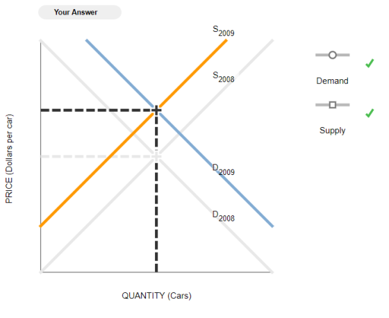
The quantity is constant (the same) and the price went up. So with the new graph, The Supply (orange) decreased (shift left) while the Demand (blue) increased (shift right).
The supply of cars decreased and the demand for cars decreased.

The two dotted lines D2 and S2 indicate the new demand and supply curves respectively after both the demand and supply have decreased thus, causing the quantity to reduce to Q2 while the price remains the same.
The following graph shows the market for cars in 2010. Between 2010 and 2011, the equilibrium...
 The following graph shows the market for cars in 2010. Between 2010 and 2011, the equilibrium quantity of cars remained constant, but the equilibrium price of cars decreased. From this, you can conclude that between 2010 and 2011, the supply of cars increased and the demand for cars decreased . Adjust the graph to illustrate your answer by showing the positions of the supply and demand curves in 2011. Note: Select and drag one or both of the curves to...
8. A supply and demand puzzle The following graph shows the market for roses in 2010....
8. A supply and demand puzzle The following graph shows the market for roses in 2010. Between 2010 and 2011, the equilibrium quantity of roses remained constant, but the equilibrium price of roses increased. From this, you can conclude that between 2010 and 2011, the supply of roses _______ and the demand for roses _______ .Adjust the graph to illustrate your answer by showing the positions of the supply and demand curves in 2011. Note: Select and drag one or both of...
The following graph shows the market for cars in 2008. Between 2008 and 2009, the equilibrium price of cars remained constant
 The following graph shows the market for cars in 2008. Between 2008 and 2009, the equilibrium price of cars remained constant, but the equilibrium quantity of cars decreased. From this, you can conclude that between 2008 and 2009, the supply of cars _______ and the demand for cars _______ .Adjust the graph to illustrate your answer by showing the positions of the supply and demand curves in 2009. Note: Select and drag one or both of the curves to the desired...
Is this right? 14. A supply and demand puzzle The following graph shows the market for...
 Is this right?
14. A supply and demand puzzle The following graph shows the market for roses in 2010. Between 2010 and 2011, the equilibrium quantity of roses remained constant, but the equilibrium price of roses decreased. From this, you can conclude that between 2010 and 2011, the supply of roses was unchanged and the demand for roses increased Adjust the graph to illustrate your answer by showing the positions of the supply and demand curves in 2011. Note: Select...
Is this right?
14. A supply and demand puzzle The following graph shows the market for roses in 2010. Between 2010 and 2011, the equilibrium quantity of roses remained constant, but the equilibrium price of roses decreased. From this, you can conclude that between 2010 and 2011, the supply of roses was unchanged and the demand for roses increased Adjust the graph to illustrate your answer by showing the positions of the supply and demand curves in 2011. Note: Select...
The following graph shows the market for roses in 2007
 A supply and demand puzzleThe following graph shows the market for roses in 2007 . Between 2007 and 2008 , the equilibrium quantity of roses remained constant, but the equilibrium price of roses decreased. From this, you can conclude that between 2007 and 2008 , the supply of roses _______ and the demand for roses _______ Adjust the graph to Illustrate your answer by showing the positions of the supply and demand curves in 2008 .Note: Select and drag one or...
The following graph shows the market for roses in 2007. Between 2007 and 2008, the equilibrium...
 The following graph shows the market for roses in 2007. Between 2007 and 2008, the equilibrium quantity of roses remained constant, but the equilibrium price of roses increased. From this, you can conclude that between 2007 and 2008, the supply of roses and the demand for roses decreased increased Adjust the graph to illustrate your answer by showing the positions of the supply and demand curves in 2008. was unchanged Ind it snaps back Note: Select and drag one or...
The following graph shows the market for laptops in 2007 . Between 2007 and 2008, the equilibrium price of laptops remained constant, but the equilibrium quantity of laptops increased.
 A supply and demand puzzleThe following graph shows the market for laptops in 2007 . Between 2007 and 2008, the equilibrium price of laptops remained constant, but the equilibrium quantity of laptops increased. From this, you can conclude that between 2007 and 2008, the supply of laptops _______ and the demand for laptops _______ Adjust the graph to illustrate your answer by showing the positions of the supply and demand curves in 2008 .Note: Select and drag one or both of...
Problem #1 14. A supply and demand puzzle The following graph shows the market for roses...
 Problem #1
14. A supply and demand puzzle The following graph shows the market for roses in 2007. Between 2007 and 2008, the equilibrium quantity of roses remained constant, but the equilibrium price of roses increased. From this, you can conclude that between 2007 and 2008, the supply of roses demand for roses and the Adjust the graph to illustrate your answer by showing the positions of the supply and demand curves in 2008. Note: Select and drag one or...
Problem #1
14. A supply and demand puzzle The following graph shows the market for roses in 2007. Between 2007 and 2008, the equilibrium quantity of roses remained constant, but the equilibrium price of roses increased. From this, you can conclude that between 2007 and 2008, the supply of roses demand for roses and the Adjust the graph to illustrate your answer by showing the positions of the supply and demand curves in 2008. Note: Select and drag one or...
The g graph shows the market for pianos in 2010. Between 2010 and 2011, the equilibrium...
 The following graph shows the market for pianos in 2010 . Between 2010 and 2011, the equilibrium price of pianos remained constant, but the equilibrium quantity of pianos decreased. From this, you can conclude that between 2010 and 2011, the supply of pianos decreased _______ and the demand for pianos _______.Adjust the graph to illustrate your answer by showing the positions of the supply and demand curves in 2011 .
The following graph shows the market for cars in 2007. Between 2007 and 2008, the equilibrium price of quantity of cars increased
 14. A supply and demand puzzle The following graph shows the market for cars in 2007. Between 2007 and 2008, the equilibrium price of quantity of cars increased. From this, you can conclude that between 2007 and 2008, the supply of cars _______ and the demand for cars _______ .Adjust the graph to illustrate your answer by showing the positions of the supply and demand curves in 2008.
 The following graph shows the market for cars in 2010. Between 2010 and 2011, the equilibrium quantity of cars remained constant, but the equilibrium price of cars decreased. From this, you can conclude that between 2010 and 2011, the supply of cars increased and the demand for cars decreased . Adjust the graph to illustrate your answer by showing the positions of the supply and demand curves in 2011. Note: Select and drag one or both of the curves to...
 Is this right?
14. A supply and demand puzzle The following graph shows the market for roses in 2010. Between 2010 and 2011, the equilibrium quantity of roses remained constant, but the equilibrium price of roses decreased. From this, you can conclude that between 2010 and 2011, the supply of roses was unchanged and the demand for roses increased Adjust the graph to illustrate your answer by showing the positions of the supply and demand curves in 2011. Note: Select...
Is this right?
14. A supply and demand puzzle The following graph shows the market for roses in 2010. Between 2010 and 2011, the equilibrium quantity of roses remained constant, but the equilibrium price of roses decreased. From this, you can conclude that between 2010 and 2011, the supply of roses was unchanged and the demand for roses increased Adjust the graph to illustrate your answer by showing the positions of the supply and demand curves in 2011. Note: Select...
 A supply and demand puzzleThe following graph shows the market for roses in 2007 . Between 2007 and 2008 , the equilibrium quantity of roses remained constant, but the equilibrium price of roses decreased. From this, you can conclude that between 2007 and 2008 , the supply of roses _______ and the demand for roses _______ Adjust the graph to Illustrate your answer by showing the positions of the supply and demand curves in 2008 .Note: Select and drag one or...
 The following graph shows the market for roses in 2007. Between 2007 and 2008, the equilibrium quantity of roses remained constant, but the equilibrium price of roses increased. From this, you can conclude that between 2007 and 2008, the supply of roses and the demand for roses decreased increased Adjust the graph to illustrate your answer by showing the positions of the supply and demand curves in 2008. was unchanged Ind it snaps back Note: Select and drag one or...
 Problem #1
14. A supply and demand puzzle The following graph shows the market for roses in 2007. Between 2007 and 2008, the equilibrium quantity of roses remained constant, but the equilibrium price of roses increased. From this, you can conclude that between 2007 and 2008, the supply of roses demand for roses and the Adjust the graph to illustrate your answer by showing the positions of the supply and demand curves in 2008. Note: Select and drag one or...
Problem #1
14. A supply and demand puzzle The following graph shows the market for roses in 2007. Between 2007 and 2008, the equilibrium quantity of roses remained constant, but the equilibrium price of roses increased. From this, you can conclude that between 2007 and 2008, the supply of roses demand for roses and the Adjust the graph to illustrate your answer by showing the positions of the supply and demand curves in 2008. Note: Select and drag one or...
Most questions answered within 3 hours.
-
Where is the error in this code sequence?
String s1 = "Hello";
String s2 = "ello";...
asked 11 months ago -
Financial data for Joel de Paris, Inc., for last year
follow:
Joel de Paris, Inc.
Balance...
asked 11 months ago -
Consider this reaction:
Al2(SO4)3 (aq)+ BaCl3
(aq) Al2Cl6 (aq)- +
3BaSO4(s) . What is the...
asked 11 months ago -
Suppose that Savneet is considering increasing her
recent random sample from 20 car rentals to 40...
asked 11 months ago -
Trucks arrive at an unloading terminal at an average rate of 120
per hour.
Trucks arrive...
asked 11 months ago -
Why are methanol and ethanol completely soluble in water while
octanol is not very little soluble....
asked 11 months ago -
A facilities manager at a university reads in a research report
that the mean amount of...
asked 11 months ago -
When the CuSO4 is rehydrated by adding water to the anhydrous
compound, is this an endothermic...
asked 11 months ago -
A ray of sunlight is passing from diamond into crown glass; the
angle of incidence is...
asked 11 months ago -
A block of mass 0.249 kg is placed on top of a light, vertical
spring of...
asked 11 months ago -
how do the kidneys compensate in the presences of acidosis
a) trigger hyperventilate
b) reserve acid...
asked 11 months ago -
Question 501 pts
The rental rate of capital to the firm increases. Which of the
following...
asked 11 months ago