The graph below shows the demand and supply of bungee jumps in Xtremeland. The government decides...
The graph below shows the demand and supply of bungee jumps in Xtremeland. The government decides to impose an excise tax on bungee jumps to help pay for the high number of back and neck injuries. Use the graph to answers the questions below.
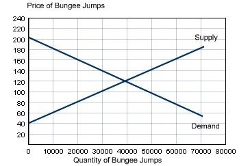
What would the government's tax revenue be if it imposes a tax of $80 on each jump?
What would the government's tax revenue be if it imposes a tax of $40 on each jump?
What would the governments's tax revenue be if it imposes a tax of $120 on each jump?
Homework Answers

Add Answer to:
The graph below shows the demand and supply of bungee jumps in Xtremeland. The government decides...
The graph below shows demand and supply in the market for airline tickets. The government decides...
 The graph below shows demand and supply in the market for
airline tickets. The government decides to introduce an excise (or
commodity) tax that pushes up the price for consumers from Pe to Pc
and decrease quantity supplied from Qe to Q1 .Use the labeling
below to identify the areas that match the terms indicated. Note
that you may place each letter multiple times, and that some
answers will require moving more than one letter into the bin to
identify...
The graph below shows demand and supply in the market for
airline tickets. The government decides to introduce an excise (or
commodity) tax that pushes up the price for consumers from Pe to Pc
and decrease quantity supplied from Qe to Q1 .Use the labeling
below to identify the areas that match the terms indicated. Note
that you may place each letter multiple times, and that some
answers will require moving more than one letter into the bin to
identify...
Consider the market for mountain bikes. The following graph shows the demand and supply for mountain...
 Consider the market for mountain bikes. The following graph shows the demand and supply for mountain bikes before the government imposes any taxes First, use the black point (plus symbol) to indicate the equilibrium price and quantity of mountain bikes in the absence of a tax. Then use the green point (triangle symbol) to shade the area representing total consumer surplus (CS) at the equilibrium price. Next, use the purple point (diamond symbol) to shade the area representing total producer...
Q19 (1 point). The table below shows the demand and supply schedules for peanuts. Suppose the...
 Q19 (1 point). The table below shows the demand and supply schedules for peanuts. Suppose the government imposes a 12 cent tax on buyers and a 48 cent tax on sellers. How much tax revenue, in dollars, is collected by the government from the tax? Numerical answer Q Supplied Q Demanded 140 4.00 20 4.10 130 40 4.20 120 60 4.30 110 80 4.40 100 100 4.50 90 120 4.60 80 140 4.70 70 160 4.80 60 180 4.90 50...
2. Taxes and welfare Consider the market for mountain bikes. The following graph shows the demand...
 2. Taxes and welfare Consider the market for mountain bikes. The following graph shows the demand and supply for mountain bikes before the government imposes any taxes. First, use the black point (plus symbol) to indicate the equilibrium price and quantity of mountain bikes in the absence of a tax. Then use the green point (triangle symbol) to shade the area representing total consumer surplus (CS) at the equilibrium price. Next, use the purple point (diamond symbol) to shade the...
Consider the market for mountain bikes. The following graph shows the demand and supply for mountain bikes before the government imposes any taxes.
 Consider the market for mountain bikes. The following graph shows the demand and supply for mountain bikes before the government imposes any taxes. First, use the black point (plus symbol) to indicate the equilibrium price and quantity of mountain bikes in the absence of a tax. Then use the green point (triangle symbol) to shade the area representing total consumer surplus (CS) at the equilibrium price. Next, use the purple point (diamond symbol) to shade the area representing total producer surplus...
Consider the market for designer purses. The following graph shows the demand and supply for designer purses before the government imposes any taxes.
 2. Taxes and welfare Consider the market for designer purses. The following graph shows the demand and supply for designer purses before the government imposes any taxes. First, use the black point (plus symbol) to indicate the equilibrium price and quantity of designer purses in the absence of a tax. Then use the green point (triangle symbol) to shade the area representing total consumer surplus (CS) at the equilibrium price. Next, use the purple point (diamond symbol) to shade the area representing...
Consider the market for commercial fans. The following graph shows the demand and supply for commercial fans before the government imposes any taxes.
 Consider the market for commercial fans. The following graph shows the demand and supply for commercial fans before the government imposes any taxes. First, use the black point (plus symbol) to indicate the equilibrium price and quantity of commercial fans in the absence of a tax. Then use the green point (triangle symbol) to shade the area representing total consumer surplus (CS) at the equilibrium price. Next, use the purple point (diamond symbol) to shade the area representing total producer surplus...
(1 point) The graph below shows the demand and supply for potatoes. How much social gain...
 (1 point) The graph below shows the demand and supply for potatoes. How much social gain is created by the 2 th pound of potatoes produced? Suppose the government imposes a sales tax on potatoes, and that as a result, the price-plus-tax rises to $10 per poun How much is the tax per pound of potatoes? Assuming the demand and supply curves are straight lines, what is the area of the triangle that represents the deadweig, loss due to the...
Assume that the market demand and supply curves for milk are as shown in the graph...
 Assume that the market demand and supply curves for milk are as
shown
in the graph below.
As shown in the graph, the market clearing price is $3 per
gallon and the quantity
exchanged is 100 gallons per hour. Now assume that the
government imposes a tax of
2$ per gallon of milk produced.
a.
What is the total tax revenue the government will collect? Also,
shade
the area on your graph where the total tax revenue is
represented.
b....
Assume that the market demand and supply curves for milk are as
shown
in the graph below.
As shown in the graph, the market clearing price is $3 per
gallon and the quantity
exchanged is 100 gallons per hour. Now assume that the
government imposes a tax of
2$ per gallon of milk produced.
a.
What is the total tax revenue the government will collect? Also,
shade
the area on your graph where the total tax revenue is
represented.
b....
 The graph below shows demand and supply in the market for
airline tickets. The government decides to introduce an excise (or
commodity) tax that pushes up the price for consumers from Pe to Pc
and decrease quantity supplied from Qe to Q1 .Use the labeling
below to identify the areas that match the terms indicated. Note
that you may place each letter multiple times, and that some
answers will require moving more than one letter into the bin to
identify...
The graph below shows demand and supply in the market for
airline tickets. The government decides to introduce an excise (or
commodity) tax that pushes up the price for consumers from Pe to Pc
and decrease quantity supplied from Qe to Q1 .Use the labeling
below to identify the areas that match the terms indicated. Note
that you may place each letter multiple times, and that some
answers will require moving more than one letter into the bin to
identify...
 Consider the market for mountain bikes. The following graph shows the demand and supply for mountain bikes before the government imposes any taxes First, use the black point (plus symbol) to indicate the equilibrium price and quantity of mountain bikes in the absence of a tax. Then use the green point (triangle symbol) to shade the area representing total consumer surplus (CS) at the equilibrium price. Next, use the purple point (diamond symbol) to shade the area representing total producer...
 Q19 (1 point). The table below shows the demand and supply schedules for peanuts. Suppose the government imposes a 12 cent tax on buyers and a 48 cent tax on sellers. How much tax revenue, in dollars, is collected by the government from the tax? Numerical answer Q Supplied Q Demanded 140 4.00 20 4.10 130 40 4.20 120 60 4.30 110 80 4.40 100 100 4.50 90 120 4.60 80 140 4.70 70 160 4.80 60 180 4.90 50...
 2. Taxes and welfare Consider the market for mountain bikes. The following graph shows the demand and supply for mountain bikes before the government imposes any taxes. First, use the black point (plus symbol) to indicate the equilibrium price and quantity of mountain bikes in the absence of a tax. Then use the green point (triangle symbol) to shade the area representing total consumer surplus (CS) at the equilibrium price. Next, use the purple point (diamond symbol) to shade the...
 (1 point) The graph below shows the demand and supply for potatoes. How much social gain is created by the 2 th pound of potatoes produced? Suppose the government imposes a sales tax on potatoes, and that as a result, the price-plus-tax rises to $10 per poun How much is the tax per pound of potatoes? Assuming the demand and supply curves are straight lines, what is the area of the triangle that represents the deadweig, loss due to the...
 Assume that the market demand and supply curves for milk are as
shown
in the graph below.
As shown in the graph, the market clearing price is $3 per
gallon and the quantity
exchanged is 100 gallons per hour. Now assume that the
government imposes a tax of
2$ per gallon of milk produced.
a.
What is the total tax revenue the government will collect? Also,
shade
the area on your graph where the total tax revenue is
represented.
b....
Assume that the market demand and supply curves for milk are as
shown
in the graph below.
As shown in the graph, the market clearing price is $3 per
gallon and the quantity
exchanged is 100 gallons per hour. Now assume that the
government imposes a tax of
2$ per gallon of milk produced.
a.
What is the total tax revenue the government will collect? Also,
shade
the area on your graph where the total tax revenue is
represented.
b....
Most questions answered within 3 hours.
-
Where is the error in this code sequence?
String s1 = "Hello";
String s2 = "ello";...
asked 11 months ago -
Financial data for Joel de Paris, Inc., for last year
follow:
Joel de Paris, Inc.
Balance...
asked 11 months ago -
Consider this reaction:
Al2(SO4)3 (aq)+ BaCl3
(aq) Al2Cl6 (aq)- +
3BaSO4(s) . What is the...
asked 11 months ago -
Suppose that Savneet is considering increasing her
recent random sample from 20 car rentals to 40...
asked 11 months ago -
Trucks arrive at an unloading terminal at an average rate of 120
per hour.
Trucks arrive...
asked 11 months ago -
Why are methanol and ethanol completely soluble in water while
octanol is not very little soluble....
asked 11 months ago -
A facilities manager at a university reads in a research report
that the mean amount of...
asked 11 months ago -
When the CuSO4 is rehydrated by adding water to the anhydrous
compound, is this an endothermic...
asked 11 months ago -
A ray of sunlight is passing from diamond into crown glass; the
angle of incidence is...
asked 11 months ago -
A block of mass 0.249 kg is placed on top of a light, vertical
spring of...
asked 11 months ago -
how do the kidneys compensate in the presences of acidosis
a) trigger hyperventilate
b) reserve acid...
asked 11 months ago -
Question 501 pts
The rental rate of capital to the firm increases. Which of the
following...
asked 11 months ago