Question
The Healthy Foods grocery store is attempting to isolate the root causes of unexpected delays at...
The Healthy Foods grocery store is attempting to isolate the root causes of unexpected delays at the checkout counters. Their research resulted in the following possible causes:
|
Cause of Error |
Frequency |
|
Price check |
141 |
|
Register out of money |
14 |
|
Bagger unavailable |
33 |
|
Register out of tape |
44 |
|
Customer forgot item |
12 |
|
Management override for incorrect entry |
86 |
|
Wrong item |
52 |
|
Other |
8 |
|
Total Errors |
390 |
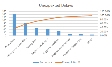
Make a Pareto chart by ranking the causes from the most frequent to the least frequent and graphing the resulting data.
Homework Answers
Answer #1
Pareto Chart
A Pareto chart is a type of chart that contains both bars and a line graph, where individual values are represented in descending order by bars, and the cumulative total percentage is represented by the line.
| Pareto chart | |||
| Cause of error | Frequency | Cummulative % | Formula example |
| Price check | 141 | 36.15% | (SUM($B$4:B4))/$B$12 |
| Management override for incorrect entry | 86 | 58.21% | |
| Wrong item | 52 | 71.54% | |
| Register out of tape | 44 | 82.82% | |
| Bagger unavailable | 33 | 91.28% | |
| Register out of money | 14 | 94.87% | |
| Customer forgot item | 12 | 97.95% | |
| Other | 8 | 100.00% | |
| Total | 390 | ||
Unexpexted Delays 160 140 120 120.00% 100.00% 80.00% 60.00% 40.00% 20.00% 0.00% Price check Other Wrong item Bagger unavailable Register out of tape Management override... Register out of money Customer forgot item 1 Frequency Cummulative %
Know the answer?
Add Answer to:
The Healthy Foods grocery store is attempting to isolate the
root causes of unexpected delays at...
Not the answer you're looking for?
Ask your own homework help question.
Our experts will answer your question WITHIN MINUTES for Free.
Similar Homework Help Questions
ADVERTISEMENT
Need Online Homework Help?
Ask
a QuestionGet Answers For Free
Most questions answered within 3 hours.
Most questions answered within 3 hours.
ADVERTISEMENT
Active Questions
-
Where is the error in this code sequence?
String s1 = "Hello";
String s2 = "ello";...
asked 11 months ago -
Financial data for Joel de Paris, Inc., for last year
follow:
Joel de Paris, Inc.
Balance...
asked 11 months ago -
Consider this reaction:
Al2(SO4)3 (aq)+ BaCl3
(aq) Al2Cl6 (aq)- +
3BaSO4(s) . What is the...
asked 11 months ago -
Suppose that Savneet is considering increasing her
recent random sample from 20 car rentals to 40...
asked 11 months ago -
Trucks arrive at an unloading terminal at an average rate of 120
per hour.
Trucks arrive...
asked 11 months ago -
Why are methanol and ethanol completely soluble in water while
octanol is not very little soluble....
asked 11 months ago -
A facilities manager at a university reads in a research report
that the mean amount of...
asked 11 months ago -
When the CuSO4 is rehydrated by adding water to the anhydrous
compound, is this an endothermic...
asked 11 months ago -
A ray of sunlight is passing from diamond into crown glass; the
angle of incidence is...
asked 11 months ago -
A block of mass 0.249 kg is placed on top of a light, vertical
spring of...
asked 11 months ago -
how do the kidneys compensate in the presences of acidosis
a) trigger hyperventilate
b) reserve acid...
asked 11 months ago -
Question 501 pts
The rental rate of capital to the firm increases. Which of the
following...
asked 11 months ago
ADVERTISEMENT