You are an analyst for a real estate brokerage. Provide an analysis of the below data that...
You are an analyst for a real estate brokerage. Provide an analysis of the below data that would be insightful to the owner of the brokerage. Show the dispersion, averages, and frequencies of the data. Include a histogram, pie chart, and line graph, as well as a brief write up of your observations about the data.
| Price | Bedrooms | Size | Pool | Distance | Twnship | Garage | Baths | |
| 263.1 | 4 | 2300 | 0 | 17 | 5 | 1 | 2 | |
| 182.4 | 4 | 2100 | 1 | 19 | 4 | 0 | 2 | |
| 242.1 | 3 | 2300 | 1 | 12 | 3 | 0 | 2 | |
| 213.6 | 2 | 2200 | 1 | 16 | 2 | 0 | 2.5 | |
| 139.9 | 2 | 2100 | 1 | 28 | 1 | 0 | 1.5 | |
| 245.4 | 2 | 2100 | 0 | 12 | 1 | 1 | 2 | |
| 327.2 | 6 | 2500 | 1 | 15 | 3 | 1 | 2 | |
| 271.8 | 2 | 2100 | 1 | 9 | 2 | 1 | 2.5 | |
| 221.1 | 3 | 2300 | 0 | 18 | 1 | 0 | 1.5 | |
| 266.6 | 4 | 2400 | 1 | 13 | 4 | 1 | 2 | |
| 292.4 | 4 | 2100 | 1 | 14 | 3 | 1 | 2 | |
| 209 | 2 | 1700 | 1 | 8 | 4 | 1 | 1.5 | |
| 270.8 | 6 | 2500 | 1 | 7 | 4 | 1 | 2 | |
| 246.1 | 4 | 2100 | 1 | 18 | 3 | 1 | 2 | |
| 194.4 | 2 | 2300 | 1 | 11 | 3 | 0 | 2 |
Homework Answers
Using minitab we calculate the following measures and construct the graphs..


 Histogram : ( Y axis –
frequency, X axis- variable under consideration. Also the summation
of the top of the bins should be equal to the total frequency =15
for each of the histograms)
Histogram : ( Y axis –
frequency, X axis- variable under consideration. Also the summation
of the top of the bins should be equal to the total frequency =15
for each of the histograms)
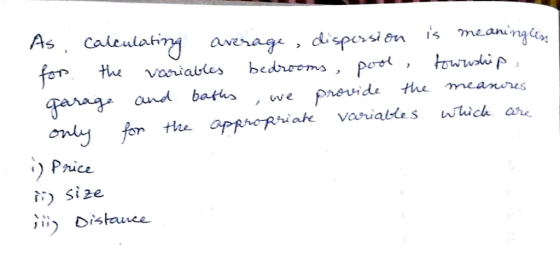
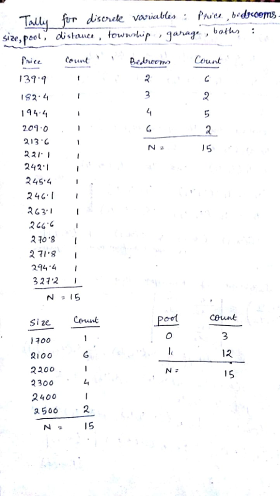
for price: there are 4 apartments of price in the range of
(262.5,287.5) , 3 apartments of price within (237.5,262.5). Rest of
the bins are decided similarly.
For bedrooms : the tallest bin says there are 6 bedrooms in 2
apartments. Also there is no apartment with 5 bedrooms. Rest of the
bins are decided similarly.
For distance : there are a total of 9 apartments in the range of
(11.25,13.75),(13.75,16.25),(16.25,18.75) with 3 apartments
belonging to each range. These are reflected in the tallest
bins.
Similarly rest of the histograms are decided.
 Pie chart: (summing up each of
the percentages, we will get 100)
Pie chart: (summing up each of
the percentages, we will get 100)
For price : We see that there are 15 different price so the pie
chart for price gives equal percentage to each of the 15 prices of
6.7%
For bedrooms : As the frequency table shows, there are different
frequencies for different number of bedrooms. For example : there
are 6 such apartments with 2 bedroom each. So the pie chart gives a
highest percentage of 40% for the 2 bedroom apartments. i.e there
are 40% apartments with 2 bedrooms. Similarly the other percentages
are decided.
For sizes : From the frequency table we see there are 6 apartments
with size 2100 so the pie chart gives a highest % of 40 to the 2100
sizes. Next is 26.7% allotted to 2300 sized apartments. Similarly
rest of the percentages are decided.
For pool : there are 12 apartments with 1 pool so the pie chart
gives 80% to pool count 12 i.e there are 80% apartments with 1
pool
For distance : there are 2 apartments with distance 13 and 2
apartments with 18 so the pie chart gives 13.3% to each of these
two apartments. Rest of the % are decided likewise.
For township : there are 5 apartments with 3 township each so pie
chart gives the highest % of 33 to the count 5 of 3
townships.
Pie chart for garage and baths are decided likewise.
Here, Line diagram is not suitable as data is not time series .
Add Answer to:
You are an analyst for a real estate
brokerage. Provide an analysis of the below data that...
The following data set is adapted from current Raleigh real estate listings for zip code 27605,...
The following data set is adapted from current Raleigh real estate listings for zip code 27605, near NCSU. (a) Using Excel, enter the following data set: BEDROOM (x1) BATHROOM (x2) SQ.FT (x3) PRICE (P) 1 1 500 $67500 1 1 800 $128000 1 1 800 $128000 2 1.5 948 $138000 2 1 904 $145000 2 2 1125 $154900 2 1.5 1050 $156000 2 2 1265 $158500 2 2 1010 $164900 2 2.5 1140 $171000 2 2 1150 $173000 4 1.5...
Most questions answered within 3 hours.
-
Where is the error in this code sequence?
String s1 = "Hello";
String s2 = "ello";...
asked 10 months ago -
Financial data for Joel de Paris, Inc., for last year
follow:
Joel de Paris, Inc.
Balance...
asked 10 months ago -
Consider this reaction:
Al2(SO4)3 (aq)+ BaCl3
(aq) Al2Cl6 (aq)- +
3BaSO4(s) . What is the...
asked 10 months ago -
Suppose that Savneet is considering increasing her
recent random sample from 20 car rentals to 40...
asked 10 months ago -
Trucks arrive at an unloading terminal at an average rate of 120
per hour.
Trucks arrive...
asked 10 months ago -
Why are methanol and ethanol completely soluble in water while
octanol is not very little soluble....
asked 10 months ago -
A facilities manager at a university reads in a research report
that the mean amount of...
asked 10 months ago -
When the CuSO4 is rehydrated by adding water to the anhydrous
compound, is this an endothermic...
asked 10 months ago -
A ray of sunlight is passing from diamond into crown glass; the
angle of incidence is...
asked 10 months ago -
A block of mass 0.249 kg is placed on top of a light, vertical
spring of...
asked 10 months ago -
how do the kidneys compensate in the presences of acidosis
a) trigger hyperventilate
b) reserve acid...
asked 10 months ago -
Question 501 pts
The rental rate of capital to the firm increases. Which of the
following...
asked 10 months ago