
Homework Answers

Add Answer to:
the graph shows the amount of money in a savings account each month. Based on the...
QUESTION 8 $500 450 E 400 350 250 2 200 쵸 E 150 C 100 U...
 QUESTION 8 $500 450 E 400 350 250 2 200 쵸 E 150 C 100 U 50 45° $50 100 150 200 250 300 350 400 450 500 550 Real Domestic Output ($B) Refer to the graph for a private closed economy. At the equilibrium level of GDP, saving will be O $100 billion. $50 billion. O $150 billion. an amount that cannot be determined from the information given
Use the graph to illustrate the effects of inflation on the money market. The interest rate...
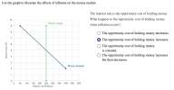 Use the graph to illustrate the effects of inflation on the money market. The interest rate is the opportunity cost of holding money. What happens to the opportunity cost of holding money 10 Money supply when inflation occurs? 8 The opportunity cost of holding money decreases. 7 The opportunity cost of holding money increases 6 The opportunity cost of holding money is constant 5 The opportunity cost of holding money increases 4 but then decreases. Money demand 2 1 250...
Use the following graph for a private closed economy to answer the next question. The multiplier...
 Use the following graph for a private closed economy to answer
the next question.
The multiplier for the above economy is:
A. 2
B. 3
C. 4
D. 5
$500 C+I 450 E 400 350 a 300 250 으 200 E 150 100 U 50 45° $50 100 150 200 250 300 350 400 450 500 550 Real Domestic Output ($B) 0 3 9
Use the following graph for a private closed economy to answer
the next question.
The multiplier for the above economy is:
A. 2
B. 3
C. 4
D. 5
$500 C+I 450 E 400 350 a 300 250 으 200 E 150 100 U 50 45° $50 100 150 200 250 300 350 400 450 500 550 Real Domestic Output ($B) 0 3 9
O -18 points The graph below shows the kinetic energy of a cart with respect to...
 O -18 points The graph below shows the kinetic energy of a cart with respect to time. Use this graph to answer the KE vs. Time 500 450 350- 300 250 +-4- 200 150 50 0 10 15 20 25 30 35 40 45 50 Time (s)
Consumption expenditure (billions of 2009 dollars) 350- The graph shows the consumption function. What is the...
 Consumption expenditure (billions of 2009 dollars) 350- The graph shows the consumption function. What is the marginal propensity to consume, and what is autonomous consumption? 300 CF The marginal propensity to consume is 250- >>> Answer to 2 decimal places. 200- Autonomous consumption is $billion. 150 100 50- 0- 0 100 200 300 400 Disposable income (billions of 2009 dollars)
7. Effect of a tax on buyers and sellers The following graph shows the daily market...
 7. Effect of a tax on buyers and sellers The following graph shows the daily market for shoes. Suppose the government institutes a tax of $11.60 per pair. This places a wedge between the price buyers pay and the price sellers receive 50 45 40 Supply 35 - a 30 25 W 20 a 15 10 Tax Wedge 1 Demand 0 50 100 150 200 250 300 350 400 450 500 QUANTITY (Pairs of shoes)
12. Market equilibrium and disequilibrium The following graph shows the monthly demand and supply curves in...
 12. Market equilibrium and disequilibrium The following graph shows the monthly demand and supply curves in the market for teapots Use the graph input tool to help you answer the following questions. Enter an amount into the Price field to see the quantity demanded and quantity supplied at that price. You will not be graded on any changes you make to this graph Graph Input Tool Market for Teapots 72 Price (Dollars per teapot) Su 24 64 Quantit Demanded (Teapots)...
For each of the intersections shown in the following figures, determine whether the data support each...
 For each of the intersections shown in the following figures, determine whether the data support each of the nine signal warrants. For each problem, and each warrant, indicate whether the warrant is (a) met (b) not met (c) not applicable (d) insufficient information given to assess. For each problem, indicate (a) whether a signal is warranted, (b) the type of signalization that should be considered, and (c) whether pedestrian signals and/or pushbuttons are recommended In all cases, assume that no...
Arturo's Production Possibilities Frontier Dina's Production Possibilities Frontier 500 450 350 350 300 250 300 150...
 Arturo's Production Possibilities Frontier Dina's Production Possibilities Frontier 500 450 350 350 300 250 300 150 100 50 150 50 100 150 200 250 300 350 400 aces 50 100 150 200 250 300 350 400es Refer to Figure 3-14. Arturo would incur an opportunity cost of 36 burritos if he in O a. 27. O b. 48. O d. 144 A-Z
Consider the Bolivian market for lemons. The following graph shows the domestic demand and domestic supply...
 Consider the Bolivian market for lemons. The following graph shows the domestic demand and domestic supply curves for lemons in Bolivia. Suppose Bolivia's government currently does not allow international trade in lemons. Use the black point (plus symbol) to indicate the equilibrium price of a ton of lemons and the equilibrium quantity of lemons in Bolivia in the absence of international trade. Then, use the green triangle (triangle symbol) to shade the area representing consumer surplus in equilibrium. Finally, use...
 QUESTION 8 $500 450 E 400 350 250 2 200 쵸 E 150 C 100 U 50 45° $50 100 150 200 250 300 350 400 450 500 550 Real Domestic Output ($B) Refer to the graph for a private closed economy. At the equilibrium level of GDP, saving will be O $100 billion. $50 billion. O $150 billion. an amount that cannot be determined from the information given
 Use the graph to illustrate the effects of inflation on the money market. The interest rate is the opportunity cost of holding money. What happens to the opportunity cost of holding money 10 Money supply when inflation occurs? 8 The opportunity cost of holding money decreases. 7 The opportunity cost of holding money increases 6 The opportunity cost of holding money is constant 5 The opportunity cost of holding money increases 4 but then decreases. Money demand 2 1 250...
 Use the following graph for a private closed economy to answer
the next question.
The multiplier for the above economy is:
A. 2
B. 3
C. 4
D. 5
$500 C+I 450 E 400 350 a 300 250 으 200 E 150 100 U 50 45° $50 100 150 200 250 300 350 400 450 500 550 Real Domestic Output ($B) 0 3 9
Use the following graph for a private closed economy to answer
the next question.
The multiplier for the above economy is:
A. 2
B. 3
C. 4
D. 5
$500 C+I 450 E 400 350 a 300 250 으 200 E 150 100 U 50 45° $50 100 150 200 250 300 350 400 450 500 550 Real Domestic Output ($B) 0 3 9
 O -18 points The graph below shows the kinetic energy of a cart with respect to time. Use this graph to answer the KE vs. Time 500 450 350- 300 250 +-4- 200 150 50 0 10 15 20 25 30 35 40 45 50 Time (s)
 Consumption expenditure (billions of 2009 dollars) 350- The graph shows the consumption function. What is the marginal propensity to consume, and what is autonomous consumption? 300 CF The marginal propensity to consume is 250- >>> Answer to 2 decimal places. 200- Autonomous consumption is $billion. 150 100 50- 0- 0 100 200 300 400 Disposable income (billions of 2009 dollars)
 7. Effect of a tax on buyers and sellers The following graph shows the daily market for shoes. Suppose the government institutes a tax of $11.60 per pair. This places a wedge between the price buyers pay and the price sellers receive 50 45 40 Supply 35 - a 30 25 W 20 a 15 10 Tax Wedge 1 Demand 0 50 100 150 200 250 300 350 400 450 500 QUANTITY (Pairs of shoes)
 12. Market equilibrium and disequilibrium The following graph shows the monthly demand and supply curves in the market for teapots Use the graph input tool to help you answer the following questions. Enter an amount into the Price field to see the quantity demanded and quantity supplied at that price. You will not be graded on any changes you make to this graph Graph Input Tool Market for Teapots 72 Price (Dollars per teapot) Su 24 64 Quantit Demanded (Teapots)...
 For each of the intersections shown in the following figures, determine whether the data support each of the nine signal warrants. For each problem, and each warrant, indicate whether the warrant is (a) met (b) not met (c) not applicable (d) insufficient information given to assess. For each problem, indicate (a) whether a signal is warranted, (b) the type of signalization that should be considered, and (c) whether pedestrian signals and/or pushbuttons are recommended In all cases, assume that no...
 Arturo's Production Possibilities Frontier Dina's Production Possibilities Frontier 500 450 350 350 300 250 300 150 100 50 150 50 100 150 200 250 300 350 400 aces 50 100 150 200 250 300 350 400es Refer to Figure 3-14. Arturo would incur an opportunity cost of 36 burritos if he in O a. 27. O b. 48. O d. 144 A-Z
 Consider the Bolivian market for lemons. The following graph shows the domestic demand and domestic supply curves for lemons in Bolivia. Suppose Bolivia's government currently does not allow international trade in lemons. Use the black point (plus symbol) to indicate the equilibrium price of a ton of lemons and the equilibrium quantity of lemons in Bolivia in the absence of international trade. Then, use the green triangle (triangle symbol) to shade the area representing consumer surplus in equilibrium. Finally, use...
Most questions answered within 3 hours.
-
Where is the error in this code sequence?
String s1 = "Hello";
String s2 = "ello";...
asked 11 months ago -
Financial data for Joel de Paris, Inc., for last year
follow:
Joel de Paris, Inc.
Balance...
asked 11 months ago -
Consider this reaction:
Al2(SO4)3 (aq)+ BaCl3
(aq) Al2Cl6 (aq)- +
3BaSO4(s) . What is the...
asked 11 months ago -
Suppose that Savneet is considering increasing her
recent random sample from 20 car rentals to 40...
asked 11 months ago -
Trucks arrive at an unloading terminal at an average rate of 120
per hour.
Trucks arrive...
asked 11 months ago -
Why are methanol and ethanol completely soluble in water while
octanol is not very little soluble....
asked 11 months ago -
A facilities manager at a university reads in a research report
that the mean amount of...
asked 11 months ago -
When the CuSO4 is rehydrated by adding water to the anhydrous
compound, is this an endothermic...
asked 11 months ago -
A ray of sunlight is passing from diamond into crown glass; the
angle of incidence is...
asked 11 months ago -
A block of mass 0.249 kg is placed on top of a light, vertical
spring of...
asked 11 months ago -
how do the kidneys compensate in the presences of acidosis
a) trigger hyperventilate
b) reserve acid...
asked 11 months ago -
Question 501 pts
The rental rate of capital to the firm increases. Which of the
following...
asked 11 months ago