Follow all the instructions and guidance for this assignment. Use the formulas we reviewed in class,...
Follow all the instructions and guidance for this assignment. Use the formulas we reviewed in class, in addition to the absolute value ($) function.
Question 1:
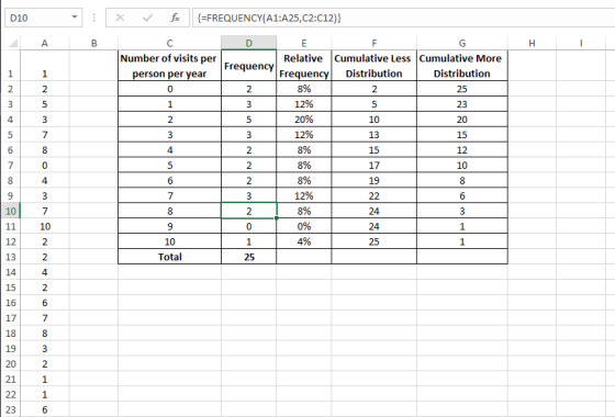
Suppose a clinic is interested in the number of visits per person per year. After selecting 25 individuals from the insured population, the following data were obtained:
1, 2, 5, 3, 7, 8, 0, 4, 3, 7, 10, 2, 2, 4, 2, 6, 7, 8, 3, 2, 1, 1, 6, 5, 0
Use Excel to construct a frequency distribution, a relative frequency distribution, and a cumulative frequency distribution. Also, construct a pie chart from the relative frequency distribution (%) and a bar chart and column chart from your frequency distribution data. Create a summary descriptive statistics table in Excel using the Descriptive Statistics Data Analysis tool (see slides from Module 5, 5.1, 5.2. 5.3) and describe this dataset using measurements of central tendency and variability (range, mean, mode, median, standard deviation).
- Leave all of your original data (the numbers used to calculate everything) on the sheet
- Use bin values of 3, 7, and 11. This should be the first column in your newly created table.
- Use the Excel “Histogram” tool to create your frequency table. Leave this table in your Excel sheet to “show your work.”
- Create a new table into which you will paste data from the histogram table Excel creates for you.
- Use bin values of 3, 7, and 11. This should be the first column in your newly created table.
- To the right of your BIN values column, put another descriptive column denoting the frequency distributions: 0 to 3, 4 to 7, and 8 to 11.
- Paste the data from your histogram table into the new table you have created.
- Add a new descriptive column in your table to identify your cumulative frequencies (i.e., 0 – 3, 0 – 8, 0 – 11). This column will be just to the left of the cumulative frequencies created by your data analysis toolpak table.
- Add a new title above your descriptive statistics table identifying your data.
- Use the absolute cell function ($) to create your relative frequency column (see PP slides).
- Delete “Series 1” from your charts or replace it with the appropriate verbiage.
- Add data labels in each chart.
- Use Exhibits 4.1 and 4.6 as guides.
- LABEL each axis (x and y) and put an appropriate title on your chart.
- In approximately three – five sentences, tell me a little about your data (groups, min/max, frequencies, central tendency, variability, etc.) in “words your grandmother would understand.”
Question 2:
The following data depict the occupancy rate, expressed as a percentage, during the past 12 months (Jan – Dec):
97, 98, 95, 94, 93, 91, 89, 90, 87, 88, 86, 85
Use Excel to construct a line chart depicting monthly changes in the occupancy rate. Describe the implications of the chart and the general trend.
Question 3:
Name the four ways that distributions (shapes) can be different from one another. Describe and differentiate between these four types of distributions.
Question 4:
What types of charts have you seen presented? What type of data are displayed in these different charts? For example, why might some want to use a bar chart? What about a line chart? How about a pie chart? When do you think these different ways to display data would be used?
Homework Answers
1.
Constructing a frequency distribution, a relative frequency distribution, a cumulative less distribution, and a cumulative more distribution

Add Answer to:
Follow all the instructions and guidance for this assignment.
Use the formulas we reviewed in class,...
unit 3 central tengency assignment
he following data set is from a survey of the weekly number of hours spent exercising for 40 high school students.81014311911511171311913681015310131215131251757955109122768Ungrouped Data SetOrder the data set and determine the mean, median and mode.Grouped Data SetCalculate the bin width that will divide the data into 5 intervals. Show your calculations in a Word or WordPerfect document.Complete the frequency distribution table using the bin width calculated in question 1 and copy it into a Word or WordPerfect document.IntervalMidpointTallyFrequencyRelative FrequencyCumulative FrequencyProduce a histogram...
Use only the Excel functions (no calculator). I need to see all Excel formulas to give...
 Use only the Excel functions (no calculator). I need to see all
Excel formulas to give you a full credit. Give answers to the 4th
decimal place.
1. (Sheet #1) (10 points) Use the following categorical
frequency distribution to answer each problem. a. (4 pts) Create a
pie chart and pareto chart. b. (3 pts) Add two more columns:
Relative Frequency (rf) and Cumulative Relative Frequency (crf).
Calculate rf and crf. c. (1 pt.) Find a mean. d. (1 pt.)...
Use only the Excel functions (no calculator). I need to see all
Excel formulas to give you a full credit. Give answers to the 4th
decimal place.
1. (Sheet #1) (10 points) Use the following categorical
frequency distribution to answer each problem. a. (4 pts) Create a
pie chart and pareto chart. b. (3 pts) Add two more columns:
Relative Frequency (rf) and Cumulative Relative Frequency (crf).
Calculate rf and crf. c. (1 pt.) Find a mean. d. (1 pt.)...
2. Let's now use Excel to simulate rolling two 6-sided dice and finding the minimum of...
 2. Let's now use Excel to simulate rolling two 6-sided dice and finding the minimum of both dice. • Create a new Excel sheet in your document. Click on cell Al, then click on the function icon f. and select Math&Trig, then select RANDBETWEEN. In the dialog box, enter 1 for bottom and enter 6 for top. • After getting the random number in the first cell, click and hold down the mouse button to drag the lower right corner...
Boost 9:18 PM a instructure-uploads.s3.amazon C 1 of 1 DSC 5050-850 Foundations of Business Statistics Assignment...
 Boost 9:18 PM a instructure-uploads.s3.amazon C 1 of 1 DSC 5050-850 Foundations of Business Statistics Assignment #1-Frequency Tables and Graphs (20 points) The data below come from a sample of continuous data. 17.3 208 25.2 8.6 19.6 23. 6. 24.3 28.5 167 10.5 261 31.3 16.4 24.8 29.6 8.6 224 9 78 28.3 25.6 17.5 25.0 4.2 239 114 26.8 89 20.6 21.3 24.9 7.3 18.8 264 19.1 27.5 21.8 117 227 1. 2. (4 points) (6 points) a. the...
Show all of the steps that you use to arrive at your answer. Explain your reasoning....
Show all of the steps that you use to arrive at your answer. Explain your reasoning. Numbers without an adequate explanation of why will receive less than full credit. (60 points) Using Excel, construct a frequency distribution table and a corresponding histogram of the 39 body temperatures ( ̊F) listed below. Use a class width of 0.5 and a starting value of 95.0 ̊F. Use the class midpoint value for the horizontal scale on the histogram. Attached is an Excel...
The following data was collected from a survey on student's exercise habits. Hours Frequency 0 to...
 The following data was collected from a survey on student's exercise habits. Hours Frequency 0 to 2 3 to 5 6 to 8 9 to 11 12 to 14 10 12 13 Preferred Exercise Frequency Runnin Yoga Weights Exercise Class Swimming 15 1) Use Excel to create a bar graph (column graph in Excel) or a histogram for each table. Use the appropriate graph for each table. Include a chart title and axis labels on each graph. 2) How is...
2. The following data show the number of cars that arrived at a Tim-Hortons drive-through between...
2. The following data show the number of cars that arrived at a Tim-Hortons drive-through between 10:00 AM and 11:00 AM each Monday for the past 50 weeks: 1 6 5 4 2 7 5 3 4 5 3 6 6 9 6 8 4 3 3 1 2 3 3 5 7 3 4 4 2 1 8 3 3 3 5 2 8 2 5 3 6 1 1 5 8 3 2 2 5 4 (a) Construct...
Assignment 1-2019 1. X: 23 22 44 12 25  
Assignment 1-2019 1. X: 23 22 44 12 25 24 16 50 42 21 21 36 23 22 41 Y: 50 50 50 50 50 49 43 44 48 47 46 8 3 4 2 P: 5 3 5 7 12 5 43 15 17 11 48 50 41 12 50 a) Make a frequency distributions for data set x and i=1 b) Combine set x, y and p and make a grouped frequency distribution (use i = 4, first bin 2-5). c) Using the same data and distribution add a column that shows the proportion frequency and the relative frequency (%) d) add a further column that shows the cumulative frequency. 2. Use the following grouped frequency distribution to answer the following questions. Score f...
Styles You need to use the data from Week 3 and based on the frequency table...
 Styles You need to use the data from Week 3 and based on the frequency table of this data, you need to create the required visuals including the pi chart and the histogram Infection Class Frequency 2015 18 Infections 6-81 Hospital 82-156 89 1 157-231 58 232-306 1 3 96 4 206 31 Check for Outliers 6 16 88.25 IQR 249 7 Lower -102.875 79 250.125 Upper 29 9 10 Create at least three visuals using your data. Visuals must...
- A variable is a. Unit upon which measurements are made b. Data collection form c....
- A variable is a. Unit upon which measurements are made b. Data collection form c. The characteristic being measured d. The realized measurement - For what kind of data are bar graphs best suited? a. Nominal or Ordinal b. Ordinal or Interval c. Nominal or Interval d. Interval or Ratio - Histograms display frequencies for what level of measurement? a. Ordinal b. Interval or Ratio c. Categorical d. Nominal - The term for a value that best describes the...
 Use only the Excel functions (no calculator). I need to see all
Excel formulas to give you a full credit. Give answers to the 4th
decimal place.
1. (Sheet #1) (10 points) Use the following categorical
frequency distribution to answer each problem. a. (4 pts) Create a
pie chart and pareto chart. b. (3 pts) Add two more columns:
Relative Frequency (rf) and Cumulative Relative Frequency (crf).
Calculate rf and crf. c. (1 pt.) Find a mean. d. (1 pt.)...
Use only the Excel functions (no calculator). I need to see all
Excel formulas to give you a full credit. Give answers to the 4th
decimal place.
1. (Sheet #1) (10 points) Use the following categorical
frequency distribution to answer each problem. a. (4 pts) Create a
pie chart and pareto chart. b. (3 pts) Add two more columns:
Relative Frequency (rf) and Cumulative Relative Frequency (crf).
Calculate rf and crf. c. (1 pt.) Find a mean. d. (1 pt.)...
 2. Let's now use Excel to simulate rolling two 6-sided dice and finding the minimum of both dice. • Create a new Excel sheet in your document. Click on cell Al, then click on the function icon f. and select Math&Trig, then select RANDBETWEEN. In the dialog box, enter 1 for bottom and enter 6 for top. • After getting the random number in the first cell, click and hold down the mouse button to drag the lower right corner...
 Boost 9:18 PM a instructure-uploads.s3.amazon C 1 of 1 DSC 5050-850 Foundations of Business Statistics Assignment #1-Frequency Tables and Graphs (20 points) The data below come from a sample of continuous data. 17.3 208 25.2 8.6 19.6 23. 6. 24.3 28.5 167 10.5 261 31.3 16.4 24.8 29.6 8.6 224 9 78 28.3 25.6 17.5 25.0 4.2 239 114 26.8 89 20.6 21.3 24.9 7.3 18.8 264 19.1 27.5 21.8 117 227 1. 2. (4 points) (6 points) a. the...
 The following data was collected from a survey on student's exercise habits. Hours Frequency 0 to 2 3 to 5 6 to 8 9 to 11 12 to 14 10 12 13 Preferred Exercise Frequency Runnin Yoga Weights Exercise Class Swimming 15 1) Use Excel to create a bar graph (column graph in Excel) or a histogram for each table. Use the appropriate graph for each table. Include a chart title and axis labels on each graph. 2) How is...
 Styles You need to use the data from Week 3 and based on the frequency table of this data, you need to create the required visuals including the pi chart and the histogram Infection Class Frequency 2015 18 Infections 6-81 Hospital 82-156 89 1 157-231 58 232-306 1 3 96 4 206 31 Check for Outliers 6 16 88.25 IQR 249 7 Lower -102.875 79 250.125 Upper 29 9 10 Create at least three visuals using your data. Visuals must...
Most questions answered within 3 hours.
-
Where is the error in this code sequence?
String s1 = "Hello";
String s2 = "ello";...
asked 10 months ago -
Financial data for Joel de Paris, Inc., for last year
follow:
Joel de Paris, Inc.
Balance...
asked 10 months ago -
Consider this reaction:
Al2(SO4)3 (aq)+ BaCl3
(aq) Al2Cl6 (aq)- +
3BaSO4(s) . What is the...
asked 10 months ago -
Suppose that Savneet is considering increasing her
recent random sample from 20 car rentals to 40...
asked 10 months ago -
Trucks arrive at an unloading terminal at an average rate of 120
per hour.
Trucks arrive...
asked 10 months ago -
Why are methanol and ethanol completely soluble in water while
octanol is not very little soluble....
asked 10 months ago -
A facilities manager at a university reads in a research report
that the mean amount of...
asked 10 months ago -
When the CuSO4 is rehydrated by adding water to the anhydrous
compound, is this an endothermic...
asked 10 months ago -
A ray of sunlight is passing from diamond into crown glass; the
angle of incidence is...
asked 10 months ago -
A block of mass 0.249 kg is placed on top of a light, vertical
spring of...
asked 10 months ago -
how do the kidneys compensate in the presences of acidosis
a) trigger hyperventilate
b) reserve acid...
asked 10 months ago -
Question 501 pts
The rental rate of capital to the firm increases. Which of the
following...
asked 10 months ago