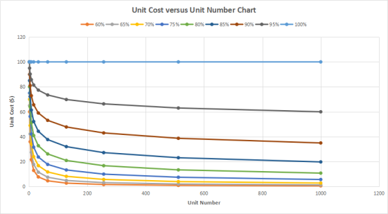
Create a graph of Unit Cost versus Unit Number (displaying Learning Rate) for an initial unit cost of $100 and a production run of 1,000 units. Learning rates should vary from 60% to 100% and should u...
Create a graph of Unit Cost versus Unit Number (displaying Learning Rate) for an initial unit cost of $100 and a production run of 1,000 units. Learning rates should vary from 60% to 100% and should use increments of 5%. Ensure you label the x- and y-axis and provide a graph title. The graph should be in its own worksheet. For help with moving the graph to a new sheet, go to How to Move a Chart onto a New Sheet in Excel (Links to an external site.)Links to an external site..
Homework Answers
Create a table of Unit cost vs unit number of learning rates from 60% to 100% in increments of 5%
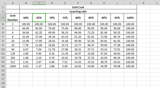
FORMULAS:
B4 =100*B$3^(LN($A4)/LN(2)) copy to B4:J14
Create a scatter graph using Excel Chart utility
Add Answer to:
Create a graph of Unit Cost versus Unit Number (displaying Learning Rate) for an initial unit cost of $100 and a production run of 1,000 units. Learning rates should vary from 60% to 100% and should u...
In cell C6, insert a Scatter Chart for the Returns Completed versus Return Price data from...
 In
cell C6, insert a Scatter Chart for the Returns
Completed versus Return Price data from the Data
worksheet. You may be used to seeing Price placed on the Y-axis
from other economics courses, but in this problem we are using
price as the independent variable.
Inserting Chart
Select the Scatter chart from the provided chart options in the
Charts group of the Insert tab of the Ribbon.
Selecting Data Series
Then choose Select Data in the Design tab on...
In
cell C6, insert a Scatter Chart for the Returns
Completed versus Return Price data from the Data
worksheet. You may be used to seeing Price placed on the Y-axis
from other economics courses, but in this problem we are using
price as the independent variable.
Inserting Chart
Select the Scatter chart from the provided chart options in the
Charts group of the Insert tab of the Ribbon.
Selecting Data Series
Then choose Select Data in the Design tab on...
Most questions answered within 3 hours.
-
Where is the error in this code sequence?
String s1 = "Hello";
String s2 = "ello";...
asked 10 months ago -
Financial data for Joel de Paris, Inc., for last year
follow:
Joel de Paris, Inc.
Balance...
asked 10 months ago -
Consider this reaction:
Al2(SO4)3 (aq)+ BaCl3
(aq) Al2Cl6 (aq)- +
3BaSO4(s) . What is the...
asked 10 months ago -
Suppose that Savneet is considering increasing her
recent random sample from 20 car rentals to 40...
asked 10 months ago -
Trucks arrive at an unloading terminal at an average rate of 120
per hour.
Trucks arrive...
asked 10 months ago -
Why are methanol and ethanol completely soluble in water while
octanol is not very little soluble....
asked 10 months ago -
A facilities manager at a university reads in a research report
that the mean amount of...
asked 10 months ago -
When the CuSO4 is rehydrated by adding water to the anhydrous
compound, is this an endothermic...
asked 10 months ago -
A ray of sunlight is passing from diamond into crown glass; the
angle of incidence is...
asked 10 months ago -
A block of mass 0.249 kg is placed on top of a light, vertical
spring of...
asked 10 months ago -
how do the kidneys compensate in the presences of acidosis
a) trigger hyperventilate
b) reserve acid...
asked 10 months ago -
Question 501 pts
The rental rate of capital to the firm increases. Which of the
following...
asked 10 months ago