Please check I have Included all data. Please Question
3. (Excel)
Question
3. (Excel)
The data for this question are the Toxic Release Inventory releases by large aquatic ecosystem in 2015. Make the following charts in Excel:
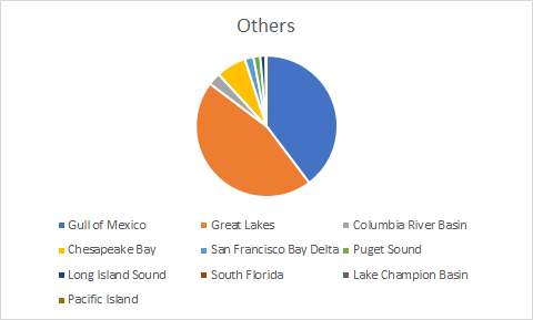
a) Separate pie charts of air, water, land, and other releases where the slices of the pie are ecosystems.
b) Side by side bar charts of air, water, land, and other releases where the bars are ecosystems.
c) Side by side bar charts switching the row and column variables for part 3b.
d) Comment on whether the bar charts of 3b or 3c make more sense.
e) Stacked bar charts of air, water, land, and other releases where the stripes on the bars are ecosystems.
f) Stacked bar charts switching the row and column variables for part e. g) Comment on whether the stacked bar charts of 3e or 3f make more sense.
Homework Answers
3)
a)


b)

c)

d) The second graph is more appropriate as through this we can judge in each ecosystem which fact is more important in case of toxic relief.
e)

f)

As said in the previous answer here also we can judge in each ecosystem what percentage of fact effect the toxic release through the second graph.
Add Answer to:
Please check I have Included all data. PleaseQuestion 3. (Excel) The data for this question are the Toxic Release Invent...
Most questions answered within 3 hours.
-
Where is the error in this code sequence?
String s1 = "Hello";
String s2 = "ello";...
asked 10 months ago -
Financial data for Joel de Paris, Inc., for last year
follow:
Joel de Paris, Inc.
Balance...
asked 10 months ago -
Consider this reaction:
Al2(SO4)3 (aq)+ BaCl3
(aq) Al2Cl6 (aq)- +
3BaSO4(s) . What is the...
asked 10 months ago -
Suppose that Savneet is considering increasing her
recent random sample from 20 car rentals to 40...
asked 10 months ago -
Trucks arrive at an unloading terminal at an average rate of 120
per hour.
Trucks arrive...
asked 10 months ago -
Why are methanol and ethanol completely soluble in water while
octanol is not very little soluble....
asked 10 months ago -
A facilities manager at a university reads in a research report
that the mean amount of...
asked 10 months ago -
When the CuSO4 is rehydrated by adding water to the anhydrous
compound, is this an endothermic...
asked 10 months ago -
A ray of sunlight is passing from diamond into crown glass; the
angle of incidence is...
asked 10 months ago -
A block of mass 0.249 kg is placed on top of a light, vertical
spring of...
asked 10 months ago -
how do the kidneys compensate in the presences of acidosis
a) trigger hyperventilate
b) reserve acid...
asked 10 months ago -
Question 501 pts
The rental rate of capital to the firm increases. Which of the
following...
asked 10 months ago